Has Traffic in London increased by 20% since 2008 and will it carry on increasing ?
This is fundamental to the traffic debate in London yet the Dept for Transport (DfT) disagrees with with Transport for London (TfL) quite dramatically on this. DfT say car traffic in London has risen around 20% in the period 2008 to 2018, and following the trend will continue to rise, whereas TfL say it has fallen slightly over this period and will continue to fall. So why do they differ and who is right ?
The difference arises directly from one survey carried out by DfT over the whole country, known as the Minor Roads Benchmarking Exercise (MRBE). TfL basically say the effects seen do not apply to London and the adjustments caused by this survey don’t agree with their independent figures.
A quick review of how traffic volume is counted is helpful here. Traffic is counted by various means but predominantly on major roads it is automatic 24hr counting, either by strips driven over or by people counting from fixed video cameras at junctions. In addition certain fixed points on the road network, on more minor roads, are counted by people using hand clicking counters and they do this at the same time of year, at the same places for a limited number of days per year. Once they know how much of each category of traffic is travelling over which category of road they multiply the figures up by the total length of that type of road on the whole road network. It is generally agreed the final figures, although they may appear to be very precise, are not that reliable as total kilometres driven, but because they are measured at the same points, either constantly, or at the same time of year, they are very good at showing any changes in the amount of traffic, ie whether it is increasing or decreasing.
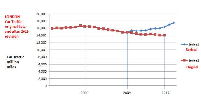
In the graph below the brown line represents the car traffic measured annually in miles by the above methods for London. As you can see from 1999 onwards the car traffic has shown a steady and constant decline to about 2013 and has flatlined since then. Then in 2018 came the Minor Roads Benchmarking Exercise. During this nationwide survey they hand counted traffic on minor roads chosen at random. They divided the roads up into urban and rural traffic and as a result they discovered there appeared to be 20% more traffic on urban minor roads so for London and other urban areas they increased their actual measured figures for 2018 by 20%. As this would look ridiculous to have a flat line graph suddenly jumping up 20% in one year they revisited all the data back to 2008 and increased them proportionally to show the blue line in the graph and these are the figures you can now find in file TRA8902. As they didn’t introduce a new file with the new adjusted figures, they simply changed ten years of data overnight. You cannot now access the old figures. I have them if anyone wants to check.

So how do we know that TfL do not agree with the changes? TfL do their own traffic flow measurements and, in addition, do many more calculations including an annual survey known as the London Travel Demand Survey (LTDS) where they ask thousands of people about their travel methods, distances etc. TfL state in their Travel In London Report 13 (2020) section 3.9 around page 92.
" The result of this exercise includes revisions to the minor road traffic estimates covering 2010 to 2018. The revisions mean that, for 2018, the DfT estimated vehicle kilometres were 20 per cent higher than previously reported last year (and included in Travel in London report 12). The previous estimates suggested a fall of 1.8 per cent in vehicle kilometres in London between 2009 and 2018, whereas the revised series now suggests an increase of 17.9 per cent over the same time period, this suggested change wholly arising from revisions to the minor road estimates. We are currently working through how the DfT have made this assessment, and what this could mean for London datasets. For this report therefore, and pending further investigation of this revision with the DfT, we consider it reasonable to base our assessment of changes between 2018 and 2019 on TfL’s own traffic monitoring data – applied to the historic DfT series – which had previously shown trends broadly in accord with the DfT data.”
This is slightly couched language but the “applied to the historic DfT series” means they are using the old figures, now not available to the public, as the new figures bear little relationship to the figures they are measuring themselves.
On page 93 we have “Trends in the numbers of motor vehicles crossing the three London strategic counting cordons and the Thames screenline provide a third indicator of traffic volumes, and they also show a broadly similar pattern to the other two indicators, prior to the revisions to the DfT series.”
And “Total flows across the three cordons were down by 0.6 per cent between 2009 and 2018 – a broadly similar trend to that shown by TfL data and, prior to the 2019 revisions, by the DfT data.”
And for cars specifically “The overall picture of declining car volumes over recent years has not affected all parts of London in the same way.”
So who is correct for London DfT or TfL ? DfT measurements were broadly in line with TfL until the nationwide MRBE was applied to London. TfL do far more research in London than DfT. But are there other ways we can check ?
If car traffic has gone up 20% in London this could only be achieved by more cars on the road or people driving more trips and/or longer journeys. The DVLA file VEH0204 shows cars registered in London increased by 2.5% between 2008 and 2018, so unless these cars were particularly busy you are looking for an increase of around 17.5% from the existing number of cars.
The London Travel Demand Survey looks at total number of trips taken by car which over this period is consistent at 5.8 million car trips per day, dropping slightly from 6 million a day ten years ago.
TfL also track the time taken for real trips in central, inner and outer London boroughs and this has barely changed over the ten year period.
So taking the above statistics together, if DfT are correct, there has been an increase in car traffic of 20% from an increase in cars of 2.5%, from the same number of trips with no slowing down of traffic overall. This would mean existing traffic would have to drive 17.5% further on average for every trip driven, with no addition congestion to slow things down. If you own two cars each would have had to have been driven 17.5% more on average. This is over a period where fixed road network length has barely changed, CPZ’s were rolled out and tube traffic increased.
Given that TfL are probably very confident they are correct why do they allow people like Rachel Aldred of Westminster University (whose work they fund), many councillors such as Ian Barnes, and numerous lobby groups such as the London Cycling Campaign, Better Streets groups and other professional lobby groups to continually claim there has been increasing car traffic in London? So much so that in Trumpian terms, if you say it often enough this becomes the facts.


