Forum topic: Covid in Enfield - not looking good!
Covid in Enfield - not looking good!
09 Dec 2020 17:19 - 09 Dec 2020 17:22 #5790- Basil Clarke
Share
![]()
![]()
 Email
Email
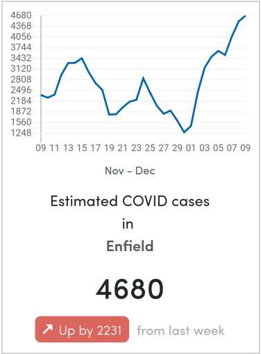
Covid figures in Enfield are moving in the wrong direction - upwards. The graph above comes from the Zoe Covid Symptom Study https://covid.joinzoe.com/.
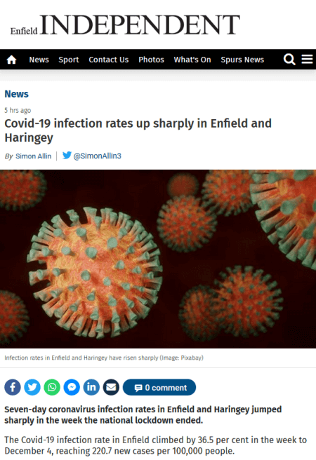
A story in the Enfield Independent, based on Public Health England data, is equally disturbing, reporting that the Covid-19 infection rate in Enfield climbed by 36.5 per cent in the week to December 4, reaching 220.7 new cases per 100,000 people. Hotspots mentioned include two nearby areas - Tatem Park and Bowes.
https://www.enfieldindependent.co.uk/news/18931514.covid-19-infection-rates-sharply-enfield-haringey/
I don't find this particularly surprising because every day I walk past shops where people aren't wearing masks or standing apart from one another. Barbers' shops are openly ignoring the rules. I saw one yesterday where a barber was shaving a customer. Neither had masks and their noses were a few inches apart. The police and council need to intervene and if necessary just close down these barbers.
Please Log in or Create an account to join the conversation.
Covid in Enfield - not looking good!
16 Dec 2020 23:20 - 16 Dec 2020 23:28 #5804- PGC Webmaster
Share
![]()
![]()
 Email
Email
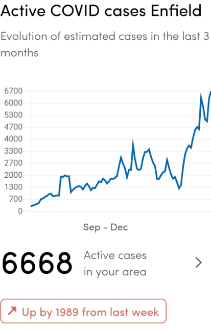
Covid is continuing to increase in Enfield, at a fast rate. This graph, from the
Zoe Covid Symptom Study
, shows the evolution since September, when rates were very low following the original lockdown.
A report in Enfield Dispatch states that the rate nearly doubled over the past week and includes this chart.
The Dispatch report is using a different measure of Covid prevalence than Zoe.
For data on smaller areas (eg Palmers Green West) go to this page and enter a postcode: https://coronavirus.data.gov.uk/details/interactive-map
Please Log in or Create an account to join the conversation.
Moderators: PGC Webmaster, Basil Clarke
Time to create page: 0.470 seconds


